Project 5.0
GE® Digital Ads


Campaign Overview
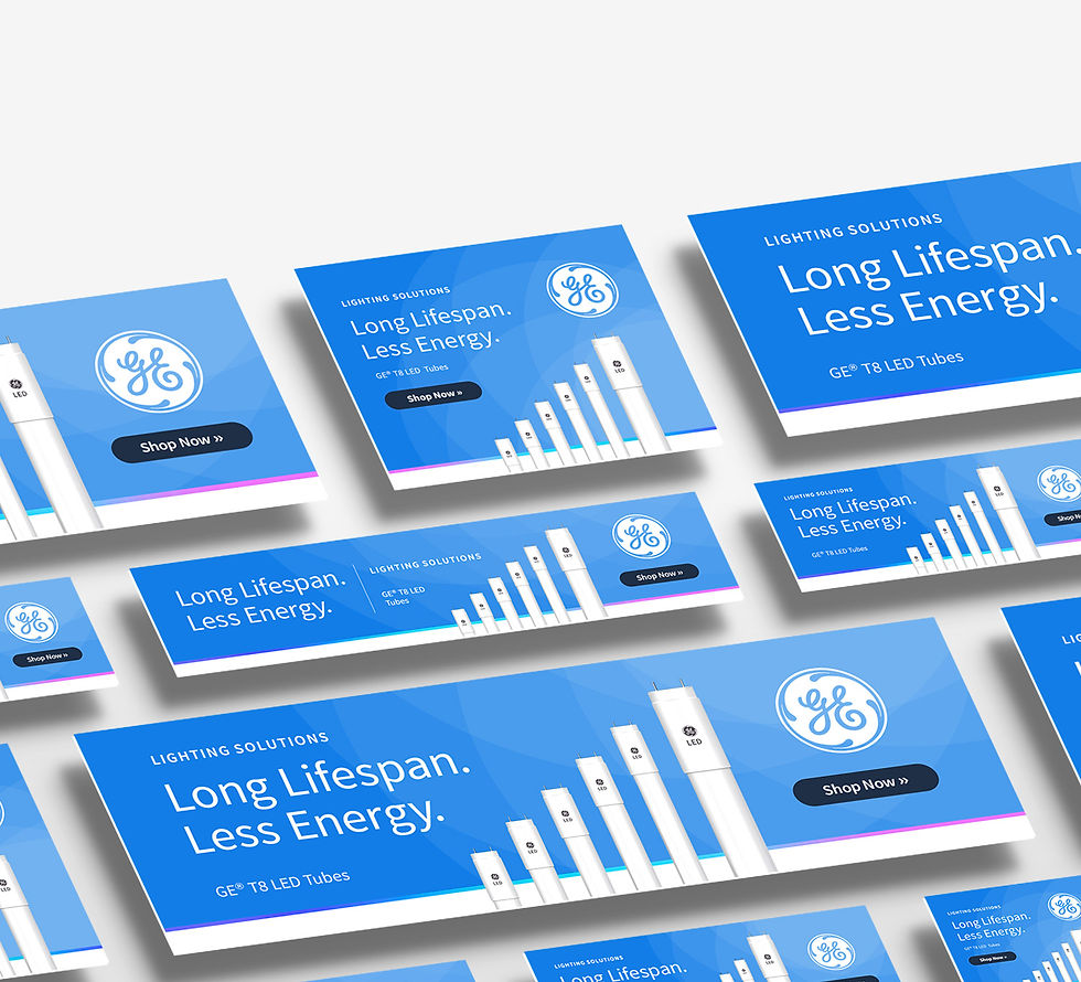
LED tubes combine to form a bar chart as a visual complement to the "long lifespan" messaging. Further, the product overlaps the white space as if protruding from (or planted in) the ground—an abstract reflection of GE®’s regular use of wind turbines for their brand's sustainability charge.
Behind the direct messaging is a geometric gradient pattern—illuminating both the product and the logo—nodding to their brand's tech-forward identity and moving the user's eye through the design.
Services Rendered
Digital Banner Design
Digital Banner Size Variations
Digital Pattern Design
Digital Banner Design


Brand Alignments
Brand colors and gradient accent
GE® Sans typeface
Technology focus (pattern)
Sustainability reference


Drawing Users' Attention
The banner design incorporates a gradient pattern comprised of overlapping circles across the background.
The hard-lined perimeter of each circle guides the user's eye across the piece and ultimately toward the call-to-action button.
Banner Design Variations